select
navigate
switch tabs
Esc close

Letters in MJF 3D Printing After Steam Smoothing

0
T
3

Hello!

I am designing a part for MJF 3D printing that contains letters and is subjected to steam smoothing. I was fluctuating between raised and embossed letters to ensure legibility and aesthetics. The letters are about 7-8 mm high and the lines of the font are 1.5-2 mm thick. Which approach – raised or embossed – preserves readability more effectively after steam smoothing, as it could affect the edges of the letters? I would appreciate insights into the best strategies/tips.

Thank you!

Automatically translated from: Deutsch
See original
Solved by Nikolaus Mroncz

Hello Tilmann 98,

Thank you very much for your question and even more so, for your activity and contributing your knowledge on our platform!!

The proportion of depth/height to width is somewhat unusual and despite the fact that we would prefer to vape with medium strength, I would prefer the raised text.

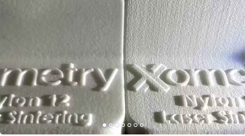
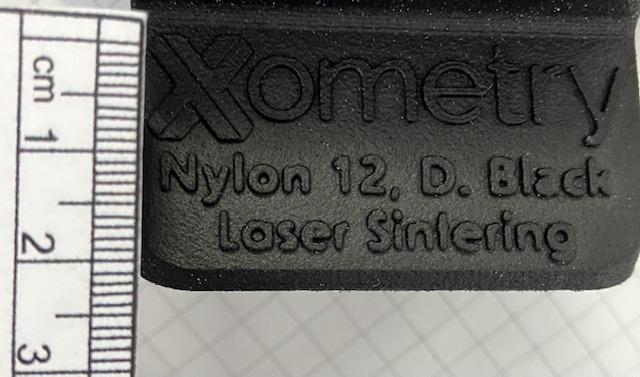
Here is a good example of the behaviour of sharpness in inscriptions

and a link to the article:

https://xometry.pro/de/artikel/3d-druck-dampfglattung/

VG

    • T
      Hello!

      I am designing a part for MJF 3D printing that contains letters and is subjected to steam smoothing. I was fluctuating between raised and embossed letters to ensure legibility and aesthetics. The letters are about 7-8 mm high and the lines of the font are 1.5-2 mm thick. Which approach – raised or embossed – preserves readability more effectively after steam smoothing, as it could affect the edges of the letters? I would appreciate insights into the best strategies/tips.

      Thank you!

      Automatically translated from: Deutsch

      See original
      0
    • Xometry Engineer

      Hello Tilmann 98,

      Thank you very much for your question and even more so, for your activity and contributing your knowledge on our platform!!

      The proportion of depth/height to width is somewhat unusual and despite the fact that we would prefer to vape with medium strength, I would prefer the raised text.

      Here is a good example of the behaviour of sharpness in inscriptions

      and a link to the article:

      https://xometry.pro/de/artikel/3d-druck-dampfglattung/

      VG

      0
      Reply
      • T
        Nikolaus Mroncz

        Thank you very much! How big are the letters in the pictures approximately?

        0
        Reply
    • Xometry Engineer

      …X has about 10mm

      0
      Reply
Letters in MJF 3D Printing After Steam Smoothing
Your information:


Suggested Topics

Topic
Replies
Views
Activity
Compact two-axis rotation without U-joints?
Hi all! I’m building a compact gimbal for a sensor head that needs to rotate around two perpendicular axes (pan and tilt). I’m trying to stay away from standard U-joints — they take up... read more
D
0
326
Aug 08
SLA wall thickness issue for microfluidic channels
Hi, I created a 3D design for a small microfluidic part using SLA (Clear Resin) with internal channels ~0.4 mm wide and wall thickness around 0.5 mm. The function relies on optical inspection through... read more
B
c
1
65
Jul 29
Embossed vs. engraved text for outdoor molded parts
Hi there, I need to add a part number and recycling symbol on the surface of molded parts in PP GF20 for outdoor use. I initially planned to use engraved text for aesthetic reasons,... read more
T
R
A
3
80
Aug 08
Minimum hole diameter vs sheet thickness 316L
Hello, I would like to produce a stainless steel 316L bracket, 3 mm thick, cut by fiber laser. I need to include several small holes for drainage and fastening, and I’ve heard there might... read more
F
A
3
104
Aug 01
Ejector pin placement near snap-fit
I’m working on a small injection-molded housing for an automotive sensor, using PA6 GF30. There are two snap-fit arms inside (cantilever type), about 2 mm-thick walls. I’m not sure where to place the ejector... read more
M
T
5
196
Jul 18