 Europe
  Türkiye
Letters in MJF 3D Printing After Steam Smoothing
T
Hello!
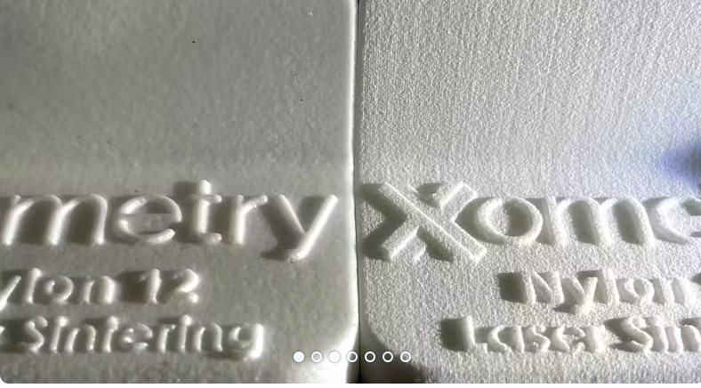
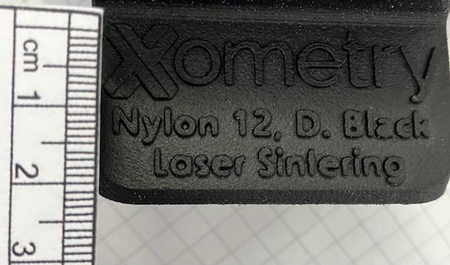
I am designing a part for MJF 3D printing that contains letters and is subjected to steam smoothing. I was fluctuating between raised and embossed letters to ensure legibility and aesthetics. The letters are about 7-8 mm high and the lines of the font are 1.5-2 mm thick. Which approach – raised or embossed – preserves readability more effectively after steam smoothing, as it could affect the edges of the letters? I would appreciate insights into the best strategies/tips.
Thank you!
Automatically translated from: Deutsch
See original
Suggested Topics
Topic
Replies
Views
Activity
DFM check: Is this part a “nightmare” to machine?
Hi! Designing a custom housing for a prototype. I’ve got features on all six sides, and I’m realizing this is going to need a ton of CNC setups. In your experience, is it better... read more
2
822
Apr 05
Robust actuator-to-brake pedal joint for angled, high-force actuation
Hi, i am designing a push-rod connection between a linear actuator and a vehicle brake pedal for a durability test setup. The actuator can apply 750 N, and the pedal rotates through its travel,... read more
2
1.4k
Mar 16
Flatness GD&T for 6061 plates
For a mounting plate for a precision sensor (about 200 mm × 200 mm) I was going to call out a flatness of 0.05 mm, but my senior engineer says that’s overkill and will double the machining... read more
3
2.4k
Mar 14
ISO 2768-mK vs specific tolerances
Hey guys, I’m getting some pushback from our shop lead. I’ve been dimensioning every single feature on a new manifold block because I’m paranoid about fitment, but he says the drawing is "unreadable" and... read more
2
2.5k
Mar 14
Thermal expansion modelling for a braced rectangular steel tank
hi, for a welded steel coolant reservoir for a test stand - 4 m × 2 m × 1.5 m with internal bracing I need to account for thermal expansion. Fluid runs at 80–90... read more
2
2.2k
Feb 04